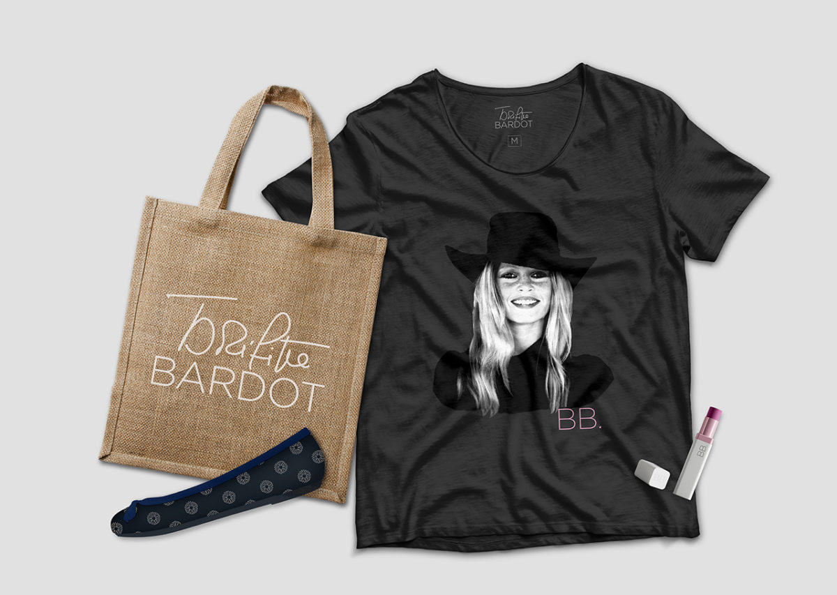
Inspiring design elements from the instantly recognisable emblems of BB.
The BRGITTE BARDOT brand is inspired by her years in the public eye: 50’s, 60’s and 70’s. During those decades, BB. embodied values which remain relevant: a positive sensuality that is authentic, bold, and resolutely French.
We are providing a range of graphic elements for our partners representing the brand’s soul: logo, symbols, icons, character, colours, fonts… All these tools have been brought together and explained in the Brigitte Bardot Brandbook and the licence holder guide.
There are, therefore, several interpretations of the BB. daisy, as a line drawing with or without a stem, at various stages of growth. This daisy has always been associated with Brigitte Bardot’s signature: “A daisy is a secret ‘I love you’ to whoever receives it.”
They are bringing this personality back to the fore with its characteristic products. They eternalise this legendary, fascinating and inspiring icon; they bring ‘joie de vivre’.
Brand signature and illustration tools have been specifically created to symbolise the brand consistently and to illustrate it beyond its many former visuals.


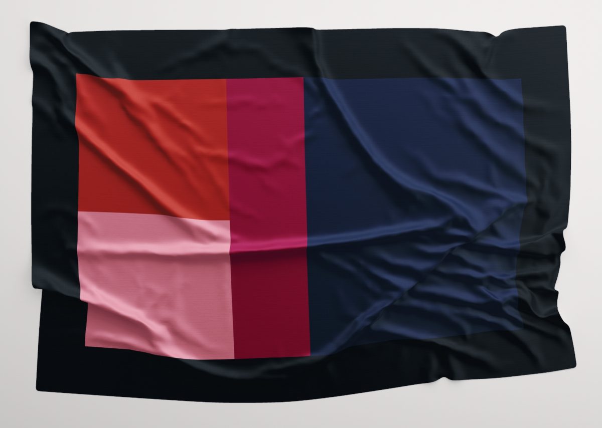
The 3 reds pay homage to the 3 major periods which marked Brigitte Bardot’s career.
– Powder Pink 50s
– Raspberry Red 60s
– Terracotta Red 70s
Midnight Blue, Black mark respectively the resolutely French side of the star and her look.
“She was the only one, the leitmotiv and the model to follow. It was with her that everything changed.“
A.A. Gill, Sunday Times (1957)
“Brigitte Bardot Bardot – Brigitte Bardot bravo! – No girl in the world – Is as nice as you – Brigitte Bardot Bardot – Oh! BB, BB,
Lyrics of Dario Moreno (1961)
BB – You should have invented yourself
If you hadn’t existed – Brigitte Bardot Bardot – Brigitte béjo béjo – Brigitte Bardot, well done! “